Just Not His Type
Marco Rubio Is a Man of Letters
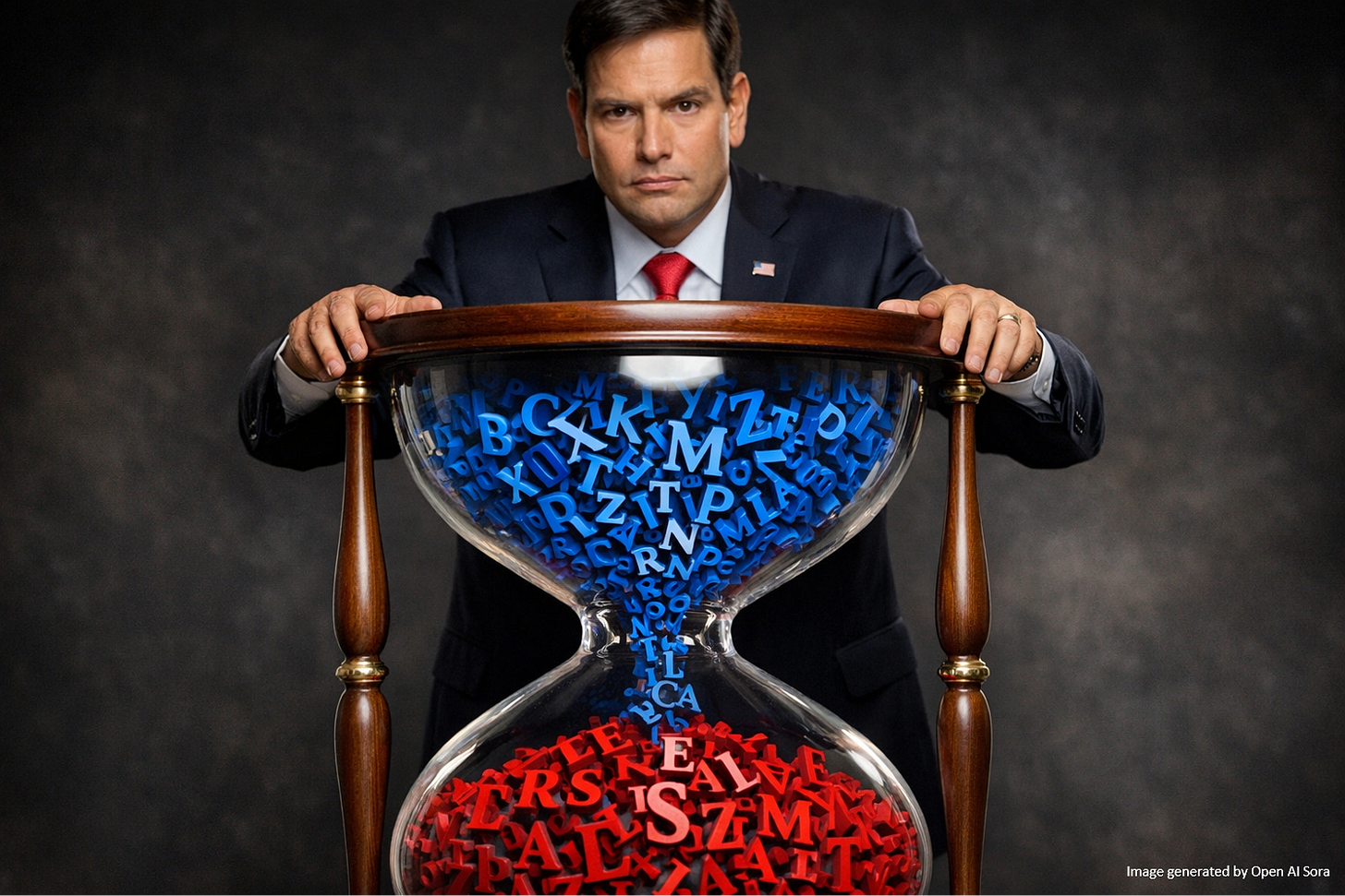
Want to annoy Secretary of State Marco Rubio? Send him a message written with Calibri font. Rubio hates Calibri; it’s too woke. Times New Roman, his font of preference, is apparently not contaminated with wokeness. But this is not about a font; it’s about a threat to the heart and soul of America.
It’s All About Appearances
“Typography affects the authority and solemnity of written text,” according to an unauthenticated copy of Rubio’s written statement on fonts published by Daring Fireball. “With their origins in Roman antiquity,” it states, “serif typefaces are generally perceived to connote tradition, formality, and ceremony.”
There were no computer users in Roman antiquity. And there certainly was no RDA – Romans with Disabilities Act. Therein lies the flaw in Rubio’s analysis.
The statement declares “Typography affects the authority and solemnity of written text,” and quotes the Foreign Affairs Handbook: “Department of State letterheads must project a sense of dignity and efficiency . . . that is appropriate to the dignity and stature of the Department.” Obsessing over fonts wreaks of “dignity and stature,” does it not? What next? Parchment gives off a classic vibe. And, if antiquity is the model, don’t overlook papyrus. Not only is papyrus an ancient form of paper, it’s an existing font. Why not use that?
Anything but Calibri. “Switching to Calibri achieved nothing,” reads Rubio’s statement, “except the degradation of the Department’s official correspondence.” That’s not a critique; it’s fonticide. Then comes the actual reason for the change:
“So, to restore decorum and professionalism to the Department’s written work products and abolish yet another wasteful DEIA program, the Department is returning to Times New Roman as its standard typeface.” (Emphasis added.) Calibri is too woke.
“Lucas de Groot designed Calibri in 2007 specifically for readability on computer screens,” notes Yello by Hunter Schwarz. “The width and curvature of its simple letterform was optimized to be easy to read, and it replaced Times New Roman as the default font in Microsoft Office in 2007 before being replaced by Aptos in 2023.”
“In January 2023, then-Secretary of State Antony Blinken adopted Calibri after the typeface was recommended by his diversity and inclusion office to improve accessibility for staff,” reported Mother Jones, “including those with disabilities like dyslexia or low vision, or people who use assistive technology like screen readers.”
“Calibri has generous letter spacing, which can help readers with reduced vision,” noted The New York Times, “while Times New Roman’s many serifs tend to intrude on its relatively tighter spacing.” The purpose of changing to Calibri was to improve access, the “a” in DEIA. Access is the reason we add “alt text” to online graphics and public entities like Pima County, Arizona make their websites readable – and accessible – to individuals with vision impairment. But Rubio is not motivated by accessibility.
“Rubio has since removed the department’s diversity and inclusion office as part of a broader move by the Trump administration to eliminate diversity policies in the federal government and universities,” notes Mother Jones.
Trump’s War on Decency
While Rubio’s action could be dismissed as a tempest in a typeface, it’s a symbol of the ugliest rot in the fetid Trump administration: the war on decency.
Why change a font to make official documentation more accessible to individuals with vision impairment? Because it’s the decent thing to do. Decency is our social currency, exchanged in simple acts of humanity: opening doors for strangers, yielding the right of way on roadways, tapping a stranger’s shoulder to advise them they dropped their cellphone, returning a lost wallet with the cash still intact, or just exchanging a friendly greeting or waving to strangers on the street.
Diversity, equity, inclusion, and accessibility are not un-American. They are positive values that animate the American dream of fair treatment. We can argue over how to implement these values and what role the government should play, but there is little argument over the fundamental necessity of fairness. Helping vision-impaired people access documents and web pages is the right thing to do. It is unfair to deny them that access.
“Trump’s rollback of Diversity, Equity, Inclusion, and Accessibility (DEIA) initiatives has led to the removal of accessibility-related content from federal websites,” notes Equal Web. “While web accessibility laws like Section 508 and WCAG compliance remain intact, weakened enforcement could create confusion and reduce proactive compliance.”
“Woke” is just another word for “decent.” Trump’s and Rubio’s attacks on what they call woke threaten what the rest of us call decency – or fairness.
The Avatar of Indecency
Donald Trump’s moral opacity contaminates his administration. It’s a contagion that enveloped Rubio and many others. How many in Trump’s administration have permanent bite marks on their lips from descending into the role of presidential ego fluffers during North Korean flavored cabinet meetings?
When beloved actor and director Rob Reiner and his wife Michele were tragically murdered by their troubled son, most of us reacted like decent human beings, even those who disagreed with their politics. Laura Ingraham, politically the opposite of Reiner, was kind and gracious. Decent. Trump was not.
As the Reiners’ friends and loved ones mourned their passing, Trump was unkind and graceless. As they cried, he gloated. As they prayed, he insulted. As they dabbed their eyes, he salted their wound. Trump is the kind of man who makes tears boil.
Americans should recoil at Trump’s indecency and vote everybody who supports him out of office at the earliest opportunity.
It’s the decent thing to do.


